Do you consider consumer trust in your work?
Subconsciously we’re sure you’re aware of developing consumer trust in your marketing. It’s a vital component in converting a potential customer into a paying customer. However for the majority of marketers it’s not directly in the forefront of requirements.
As a digital agency we have never been asked to generate trust through our digital transformations. It’s almost an unspoken expectation as part of our process.
Today we decided to break down the specifics of what makes a site trustworthy. You and I already know the basics and there’s plenty of articles that discuss these.
Instead this article looks beyond the basics at innovative functionalities that build trust and set your brand ahead.
The three gates of trust
Okay so how much do consumers actually value trust when making a purchase decision?
A 2019 study showed that trust ranked as the #4 buying consideration at 81%, after quality (85%), convenience (84%), and value (84%).
With the rise of social media, consumers are more aware of brand social responsibilities and are able to give a voice to issues of mistrust.
Two-thirds of customers would cease brand engagement if they stopped trusting the company.
Said study speaks of three gates of trust – product, customer experience and societal impact. To conquer all three is to rule the world (or earn some brownie points in purchasing, customer loyalty and advocacy).
1. Product
? The Basics
Your Product Detail Page should have:
- Product imagery (potentially video)
- Clear layout and aesthetic
- Description and product relevant information – e.g. size chart, ingredients – formatted in tabbed or accordion structure for ease of access
- Shipping, Returns, T&Cs
- Product reviews (from renown sources such as Google, Yotpo or Trustpilot)
- Integration with Instagram socials (FourSixty is our recommended partner)
? Advanced recommendations
Consumers rely on each other in their purchasing decision making process. We’re talking reviews, referrals, reassurance that your product has been tried, tested and passed.
In fact, 82% of consumers say the content of the review has convinced them to make a purchase.
Now let’s take your product trust up a notch. We’re focusing on product reviews because ultimately they make or break your sale.
? #1 Photo reviews
Consumers respond best to visuals yet reviews are typically text-only.
Customer reviews through Yotpo allows for image upload to accompany feedback. This is a free app that gives your customer community a face and humanises your product.
Imagery and video are the king and queen of online content, so why limit your product reviews to text only?
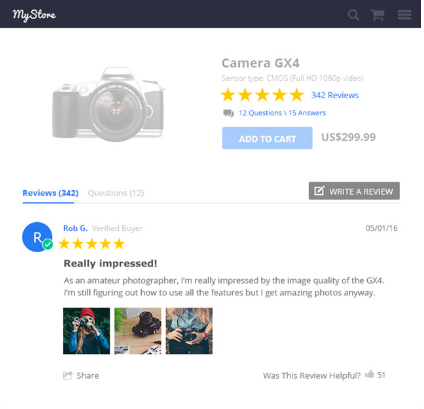
- Further stimulate the decision to buy via real world examples
- Increased transparency
- Give your customers the tools to provide thorough feedback
- Increase confidence in new customers
- Build loyalty for existing customers
- Gain valuable insights to help you improve your offering and products
? #2 Creating a Review Community
Unfortunately reviews are more often than not due to customer dissatisfaction. Without active encouragement it can be difficult to gain customer feedback and create a ‘Review Community’.
That is, a brand community that actively provides product feedback and sets this expectation from the get-go.
Online retailer OzHair & Beauty boast 42.4K certified reviews across their beauty and haircare brand and have nailed the ‘Review Community’ persona.
This is achieved through reiterated review messaging throughout the customer journey process.
The Product Detail Page has 3 x unique references to their review platform above the fold alone. Below the fold users are presented with a full list of product reviews (via pagination) and can write a review or ask a question.
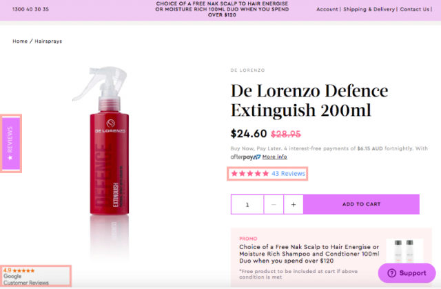
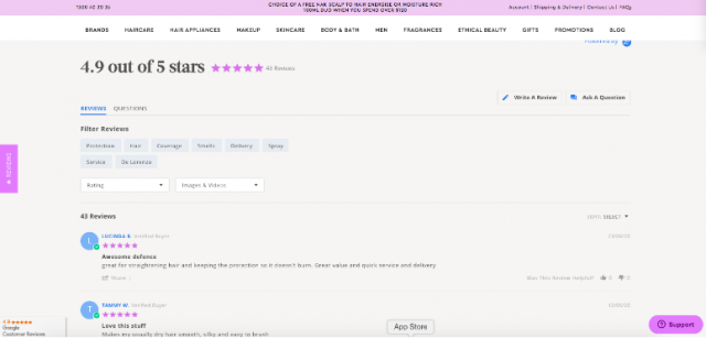
The homepage and inner pages (non-PDP) also have consistent references to OzHair’s review community via the sticky review bar and Google Customer Review in the far left corner.
Finally the footer references their 42.4K certified review tally.

Each of these elements provide and reiterate social proof in the brand’s product and reliability as a platform to reach customer expectations. It sets the precedent for the customers to supply reviews and share experiences.
By the time users make their purchase and receive a request for review via email, the review community concept is ingrained and actioned.
2. Customer Experience
We can’t discuss customer experience without discussing their data. The rise of our digital landscape positions businesses with more customer data at their fingertips (keyboard tips?) than ever before.
Two-thirds of customers would cease brand engagement if they stopped trusting the company and the most prominent area of mistrust is (you guessed it) data. As a result, we’ve mapped out a set of data specific basics and advanced recommendations.
? The Basics
Your site should have:
- Simple menu (with category names) and search functionality for navigation
- SSL Certificate
- Content that is error-free and digestible (punchy and not overly wordy)
- High quality imagery
- Relatively quick page load
- Modern aesthetic that is clean and uncluttered (clear layout of information architecture)
- Designed and built for mobile first
Your site should tackle data concerns through:
- Consent and subscription acceptance / management
- Cookie acceptance modal
- GDPR compliance modal (EU markets)
- Compliance with California Consumer Privacy Act (US markets)
- Privacy policy
- T&Cs (with reference to consumer privacy)
- Unsubscribe via eDM
? Advanced recommendations
? #1 Don’t hack my data
Businesses who are transparent on data acquisition will be trusted and earn ongoing advocates. Ultimately businesses should give customers visibility and control of their personal data if desired.
Companies who feel it’s sufficient to provide a T&Cs or Privacy Statement that they expect the user to read are missing the point.
Price Attack are explicitly clear on what information they are collecting and what it will be used for via the Newsletter signup form. Let’s face it, no one clicks on the Privacy Policy – so to display this information upfront speaks volumes.

Saas company EventsAir takes this further by providing a general statement on their approach to privacy.

Such a statement demonstrates a respect of your customer and an effort to communicate this.
?Ideas & Examples:
- We safeguard privacy.
- We take data privacy with utmost importance.
- We only use data to optimise your experience online.
- We do not sell your data to third parties.
? #2 Value proposition cards
Taking a step back from data and back into general tools to develop trust online.
Your homepage is a digital welcome mat in developing legitimacy, sophistication and trust. First impressions speak volumes, particularly above the fold.
It takes a mere 15 seconds for a user to decide whether they will stay on your website.
Value proposition cards are a simple and streamlined way to communicate key offerings to your users upon landing on the site. They can be managed as single or multi promotion strips surrounding the navigation.
?Ideas & Examples:
- Key brand offering (e.g. Australian owned, sustainable materials used)
- Free shipping offers
- Buy Now, Pay Later platforms
- Returns

The use of logos or icons here ensures the content stands out. Again the OzHair&Beauty design achieves this well.

Societal Impact
? The Basics
Your site should have:
- About us page
- Contact us page including email, address, social links, address etc.
- Team profiles to generate humanisation behind your brand (if relevant to your business)
- Your brand story and a history behind your product
- Communication of your societal impact via your product, manufacturing, sustainability, donations etc.
Footwear brand AllBirds execute this well through consistent reiteration of their sustainability approach throughout the site from the main navigation to inner page modular references.
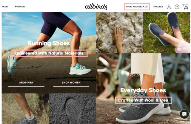

? Advanced recommendations
? #1 Tie off the user journey loop
Consumers seek brands that proactively promote beliefs aligned with their own, an extension or reflection of their own values. Your socially responsible practices could make or break a customer’s engagement with your brand.
Customers value reiteration of their impact when making a purchase. It’s one thing for the customer to be aware of your brand’s societal impact, but another to know their direct impact as a brand supporter.
For example, Australian Red Cross text their contacts once their blood or plasma donation has been used.
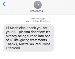
This positive reinforcement evokes endorphins. Endorphins which are now associated with engagement with your company, encouraging longer customer lifecycles and brand advocacy. It reiterates that your brand values align with your consumer, and vice versa.
?Ideas & Examples:
- Abandoned cart email or remarketing materials which reference the brand values to generate trust and encourage conversion.
- Post-purchase SMS or email detailing the impact of their purchase
- Environmental
- Sustainability
- Monetary (Dollar value donated in light of their sale)
- Support to local business and what this means (the significance of a simple ‘thank you’ is often overlooked)

